People aren’t clutching their email like it’s a social security number. They just don’t love when a site asks for it before earning even one second of trust.
The issue isn’t that you don’t have enough opt-ins. It’s that the ones you do have feel like they showed up at the wrong time, said the wrong thing, and made it weird. And then we act surprised when no one signs up.
I’m not anti email lists. I’m not even anti pop-up. I’m anti needy energy. So we’re here to build the kind of moment where they want in, not where they feel cornered into it.
Before you tweak another opt-in form or add another annoying pop-up ask yourself something slightly uncomfortable: would I sign up for my own emails right now?
Because people can feel when an opt-in is just there to grow a list. It has a certain vibe. And the vibe is usually: “we’re about to email you 3 times a week with promos you didn’t ask for.” Even if that’s not your intention, if that’s all you’re offering, people either won’t sign up… or they will, and then they will simply unsubscribe two days later.
This is where most strategies fall apart. Not at the placement. At the actual experience after someone joins.
Just so we’re not confused: your email list isn’t a clearance rack for links, discounts, and ‘hey just popping in’ sales grabs. It’s a relationship… act like you actually want to keep it.
The best lists feel like you got let into something a little more personal. Better thoughts, real opinions, things you’re testing, things you’ve learned the hard way, recommendations you’d send a friend, not a funnel. That’s the standard now. And ironically, that’s what makes people buy more. Not because they’re being pushed, but because they’re already in it with you.
Sales emails are not the problem. You should absolutely sell. But if every email is a pitch, people start skimming, then ignoring, then leaving.
When there’s context, trust, and actual value built over time, a sales email just feels like a reminder. Like “oh wait, I actually wanted this.”
Quick reality check:
Bad: “Join our newsletter for updates.”
Better: “Every Tuesday, I send one honest website tip, one behind-the-scenes design note, and one resource I’d actually send a client.”
One of these sounds like an obligation. The other sounds like something you might actually look forward to.
This is where most opt-in advice goes off the rails. It turns into “add a pop-up here, a form there, maybe a banner just in case,” and suddenly your website feels like it’s asking for five different things at once.
Every page on your site already has a job. Your opt-in should either support that job… or stay out of the way.
A homepage visitor is still figuring you out. A blog reader is in learning mode. A service page visitor is this close to making a decision. Treating all of them the same with the same “join my newsletter :)” energy is how you lose people who were actually ready to take action.
The goal isn’t maximum visibility. It’s alignment. When the opt-in matches what someone is already thinking, it feels natural. When it doesn’t, it feels like a distraction at best… and slightly chaotic at worst.
If someone is on your service page, sales page, or a product page, they’re not casually browsing. They’re evaluating. Deciding. Mentally clicking through “is this for me?”
Interrupting that with a random freebie or “wait!! grab this instead!!” opt-in is… not the move. You’re pulling them out of a decision they were already leaning into.
On these pages, your main CTA should stay very clear: book, inquire, buy, choose. If you really want an opt-in here, keep it subtle and out of the way. Footer is perfect. Let the main action do its job.
Now blog posts, resource pages, and even your homepage (after you’ve built a little desire)? Different story.
These are the spaces where people are naturally more open. They’re learning something, exploring your perspective, getting a feel for how you think. That’s the perfect moment to offer a next step that deepens the relationship.
Same with a well-placed footer opt-in. It’s always there, never pushy, and quietly picks up the people who are already interested.
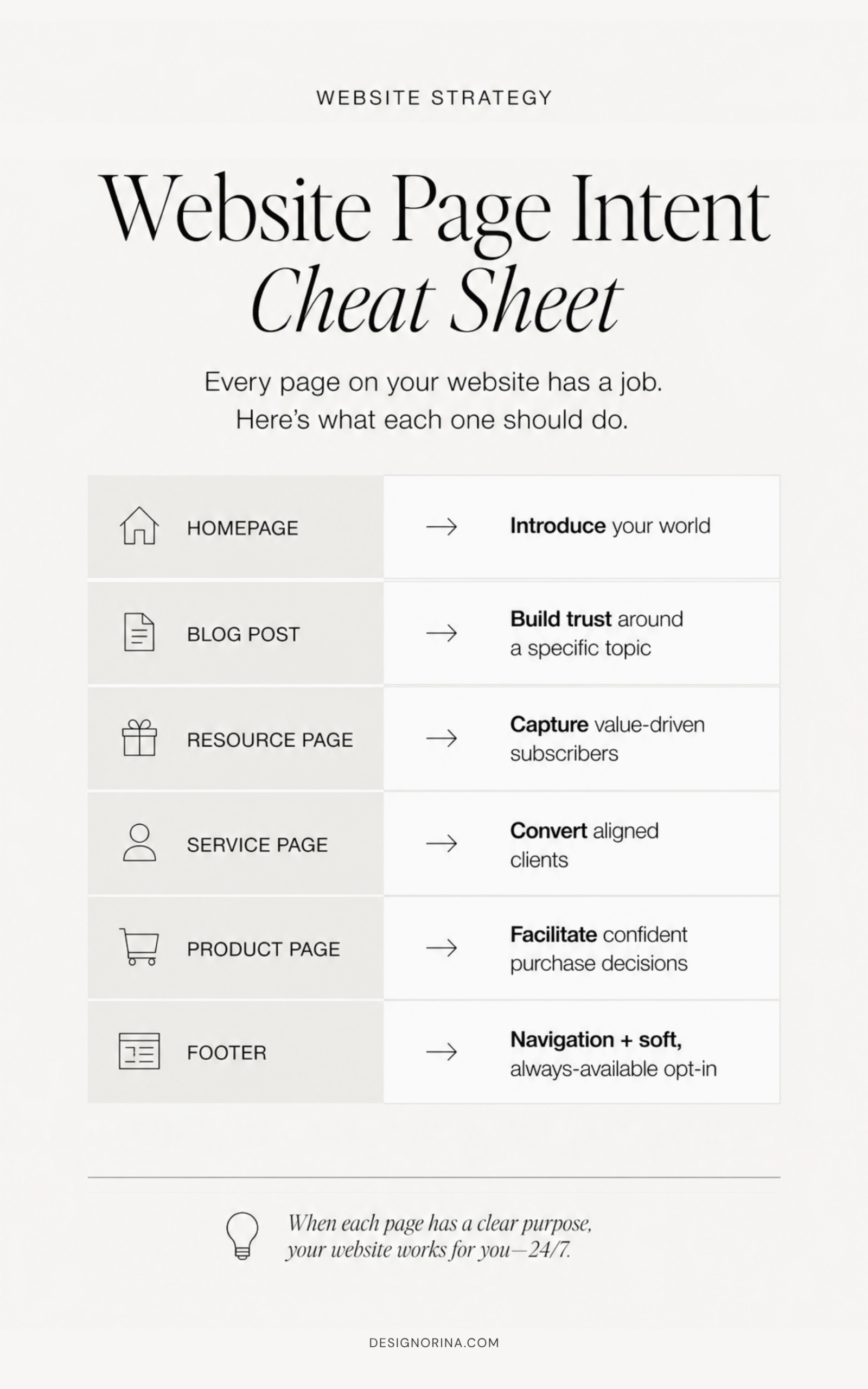
Quick page-intent cheat sheet:
Homepage = introduce your world
Blog post = build trust around a specific topic
Resource page = capture value-driven subscribers
Service page = convert aligned clients
Product page = support buying decisions
Footer = soft, always-available opt-in
When you start thinking like this, you stop asking “where can I squeeze in another form?” and start asking “what actually makes sense here?” which is where things start working a lot better.
Need help with your website strategy? Book a website audit here.
If you do nothing else, do this one thing well.
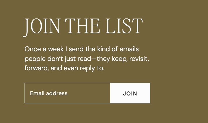
The footer is the least annoying, most natural place to invite someone onto your list. It shows up on every page, it doesn’t interrupt anything, and it quietly catches the people who already decided they like you. No pressure, no weird timing, no “wait before you go!!” energy.
I almost always recommend having an opt-in here, especially for a simple, straightforward newsletter. This is not where you write a novel. It should be short, clear, and a little bit specific. Enough for someone to think, “okay wait, I’d actually read that.”
Because by the time someone scrolls to your footer, they’ve already spent time with your site. They’ve read something, clicked around, gotten a feel for your work. The footer becomes this natural little moment of “I want more of this.”
But—and this is important—it only works if your emails are actually worth it. A vague “subscribe for updates” isn’t doing anything for you. It feels empty. You need a point of view.
Instead of:
“Subscribe to our newsletter.”
Try something like:
“Join the list for honest website tips, behind-the-scenes design notes, and resources I usually only share with clients.”
Or:
“Get the good stuff: website strategy, template tips, launch notes, and occasional offers.”
It sets a tone. It makes a promise. It feels intentional.
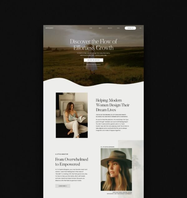
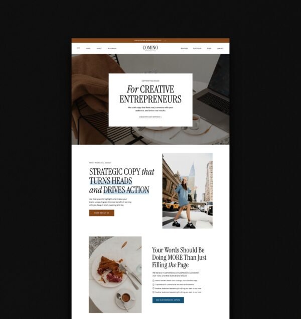
I know “grow your email list” is drilled into everyone’s brain, but making it your homepage hero CTA is… usually not it.
When someone lands on your site for the first time, they’re not thinking “how do I get more emails from this person?” They’re trying to figure out who you are, what you do, and if any of it matters to them. If the first thing they see is “join my newsletter,” it’s just too early. You haven’t earned that yet.
Your homepage has a job: orient people, build interest, and guide them toward the main action—whether that’s browsing your shop, booking a service, or understanding your offer. Your primary CTA should support that. The opt-in? That’s a secondary move.
It works best once someone actually gets your world a little bit. After they’ve read your intro, skimmed your offers, maybe seen a result or two. That’s when a homepage opt-in feels natural—like a “wait, I’m not ready to buy yet, but I do want to stay connected.”
This is where it shines. Not as the main event, but as a soft place for the right people to land.
Position it like: if you like how I think, you’ll like what I send. Make it feel a little more personal, a little more insider. You’re not asking for their email out of nowhere—you’re inviting them to keep the momentum going.
And this is also why I design homepage opt-in sections lower on the page, not shoved into the hero. They convert better because the timing makes sense.
If you’ve ever felt weird about pushing your list too hard on your homepage, this is your permission to stop doing that.
Blog posts are one of the easiest places to grow your list… and also one of the easiest places to completely fumble it.
Because yes, your reader is already in learning mode. They showed up with a question, a problem, or a very specific “please help me fix this” energy. That’s the perfect setup for an opt-in. But the second you throw in a random freebie that has nothing to do with what they’re reading, it feels like an ad break.
And people will ignore it.
A good blog opt-in should feel like the obvious next step. Like, “oh perfect, this is exactly what I need after this.” It continues the conversation instead of hijacking it.
If your post is about website headlines, give them a headline formula guide, a swipe file, or a fill-in-the-blank doc. If it’s about launching a site, give them a launch checklist. Homepage mistakes? A homepage audit worksheet.
It should feel aligned enough that not downloading it almost feels like a missed opportunity.
This is where people overcomplicate it. You do not need a 20-page PDF that took you three weeks to make. Honestly, most of those don’t even get read.
What people actually want is something they can use immediately. A checklist they can follow. A doc they can copy. A resource they can save. Something that helps them move faster, make a decision, or stop overthinking.
Good formats:
– checklist
– launch guide
– resource list
– copy-and-paste Google Doc
– tutorial or mini training
– curated links
– swipe file
– decision-making worksheet
And please… don’t make it something they could generate in ChatGPT in two minutes. The value is your brain. Your taste, your process, your examples, the way you structure things. That’s what makes it worth opting in for.
For example, I have a testimonial guide where I share my kinda-unique approach for getting testimonials that go way beyond “she was great”. They highlight my process, results, and handle objections for me. It’s something I already use in my business, and it was super easy to turn into a freebie. You can grab it here if you want to see exactly how it works.
This is where things start feeling a lot more intentional… and a lot less like you’re stuffing forms into random corners of your site.
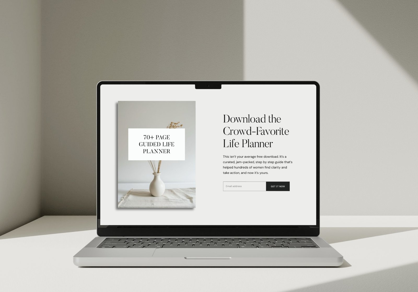
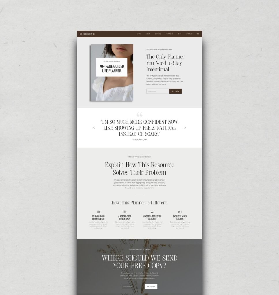
Not every opt-in needs to live inside a homepage section or a blog post. Some of your best freebies? They deserve their own little moment.
Instead of cramming everything into one “resources” page with 12 forms stacked on top of each other (we’ve all seen it, it’s overwhelming), think in layers. You can absolutely have a main resources page that acts like a library—but each freebie should link out to its own simple, focused page.
Because the second a freebie has a page, it stops feeling like a throwaway bonus and starts feeling like an actual offer.
And that changes how people engage with it.
Your resources page is great for browsing. It’s where someone can scroll, click around, and pick what they need.
But individual freebie pages? That’s where conversions happen.
These are the pages you link on Pinterest, share in Instagram captions, drop into ManyChat flows, include in blog posts, or send to someone when they ask for help with something specific. The intent is higher because they chose to land there.
Keep it simple, but make it feel considered.
You don’t need a full sales page. Just enough to make it clear and desirable:
– a strong headline
– a quick “who this is for”
– what they’re getting (be specific)
– why it’s actually useful
– a clean mockup so it feels real
– the opt-in form
– a small note that they’re joining your email list
That’s it. Two to three sections, done well, will outperform a long, messy page every time.
And this is also where your website starts acting like a system, not just a set of pages. Each freebie becomes its own entry point into your world, attracting the right people based on what they actually need.
We need to talk about pop-ups in a way that’s actually honest.
Are they a little annoying sometimes? Yes. Do they still work? Also yes. The problem isn’t the pop-up itself—it’s how aggressively people use them, like their website is about to disappear if they don’t capture your email in the next three seconds.
You’ve experienced this. You land on a site and before you’ve read a single word: boom, pop-up. Immediate trust decline. I don’t even know what you do yet, why would I join anything?
Timing is everything here.
No instant pop-up on arrival. Ever. It’s too soon.
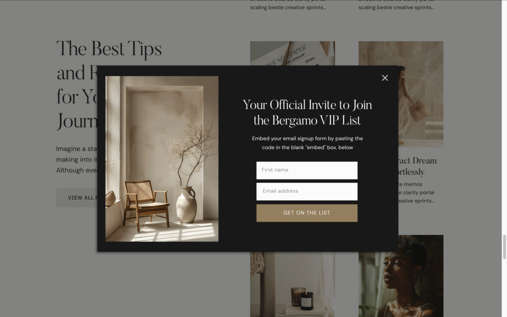
Exit-intent pop-ups on blog posts? Those can work really well. Someone’s already gotten value, they’re about to leave, and you offer them something relevant to what they just read. That feels fair.
A subtle corner pop-up after 45–90 seconds on a resource-heavy page? Also fine. By then, they’re engaged.
Discount pop-ups? Keep those on shop or product pages where it actually makes sense. If I’m reading an educational blog post and suddenly get hit with “take 15% off,” it feels random and slightly chaotic.
And please do not stack everything. Not a pop-up, and a sticky bar, and three embedded forms, and a footer all saying the same thing. That’s where the desperation energy really kicks in.
Pop-ups work when they match the context:
Blog post → offer a related freebie or checklist (bonus points for exit intent)
Product page → discount or first-order incentive
Homepage → maybe one gentle invite, not five competing ones
Service page → usually skip, unless it directly supports booking
Quick reality check:
Do: “Leaving? Grab the homepage checklist before you go.”
Don’t: “WAIT!!! Subscribe now!!!” 0.5 seconds after landing
When pop-ups are timed well and actually make sense, people don’t get annoyed—they opt in. It’s the panic energy and bad timing that ruin it.
Not all opt-ins are doing the same job, and if you treat them like they are, you end up with a list that looks good on paper but doesn’t actually convert (or worse… doesn’t even open your emails).
The type of opt-in you choose is basically choosing the starting point of the relationship.
A simple newsletter opt-in? That’s someone who already likes your perspective. They’ve read enough, seen enough, and decided “yeah, I want more of this.” These people are usually your warmest audience. They didn’t need a freebie or a discount, they just wanted in.
A discount opt-in works really well for product-based businesses, template shops, anything where someone might be on the edge of buying. It’s not inherently salesy—it’s expected. People like a little “welcome” incentive. Just be clear they’re also joining your list, and make sure what you send after isn’t just constant promos.
Lead magnets are where you win people over through value. This is for the “I have a problem, can you help me?” moment. And when the freebie actually delivers, it sets the tone for everything that comes next. It’s one of the strongest ways to build trust before a sale ever happens.
Quick way to think about it:
Newsletter opt-in → warm audience, brand trust already there
Discount opt-in → ready-to-buy energy, just needs a nudge
Lead magnet → problem-aware, looking for help
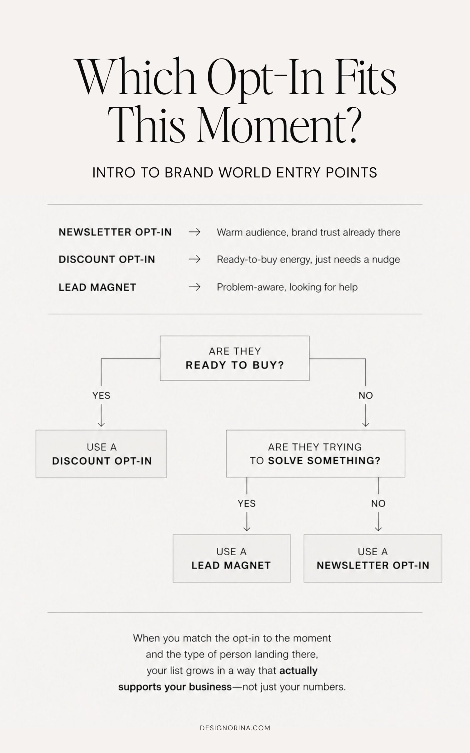
When you match the opt-in to the moment and the type of person landing there, your list grows in a way that actually supports your business—not just your numbers.
If you take one thing from this entire post, let it be this: the goal is not to squeeze in as many opt-ins as humanly possible.
That’s how you end up with a site that feels loud, scattered, and slightly desperate.
The real strategy is quieter than that. More intentional. You’re creating entry points—specific moments where someone naturally goes from “I’m just looking” to “okay wait, I want more from this person.”
And those moments look different depending on where they are.
Your footer? Always there, low-pressure, catching the people who are already in.
Your homepage? Invite them in after they understand your world.
Your blog posts? Only offer something if it actually continues what they came for.
Your freebies? Give them space to shine with their own pages.
Your pop-ups? Timed well, used lightly, never chaotic.
Your service pages? Stay focused—don’t interrupt a buying decision with something random.
Your shop? A discount can make sense, when it matches the moment.
None of this is about doing more. It’s about doing it on purpose.
Because a good website doesn’t chase people down for their email. It guides them. It makes the next step feel obvious. Comfortable, even. Like “yeah, this makes sense, I’ll stay.”
And when your site is set up this way, your email list grows with the right people—the ones who actually want to be there, open your emails, and eventually buy from you without needing to be convinced every five minutes.
If you want a website that already has these moments built in—footer opt-ins that convert, homepage sections that feel natural, resource pages that work as actual entry points, this is exactly why my templates are designed the way they are.