Elegant Canva fonts are everywhere. Good taste is not.
Elegant fonts are having a moment, but the way people are using them? Copy-paste, every time. Same combinations, same spacing, same “luxury” vibe with zero personality. A font can be stunning on its own and still feel completely off once it’s inside your brand.
Most people choose fonts from a Pinterest screenshot, a brand they’re obsessed with, or anything that vaguely looks expensive. But that’s not brand identity, that’s aesthetic imitation. After 5+ years in web design and 500+ clients, I can tell you firsthand—typography alone can shift how your brand feels instantly.
Pssst… my website templates come with intentional font pairings already built in. Go take a look!
Before we even get into specific elegant Canva fonts, we need to talk about taste. There is no single “perfect” elegant font—there’s only the one that actually matches your brand’s positioning and personality. Because “elegant” can still mean a lot of different things. It can feel literary and thoughtful, or fashion-editorial, or soft and feminine, or clean and almost clinical. Or even a little rebellious.
This is where brands either get interesting or fade into the Canva abyss. The wrong “luxury” font makes you look like every other moodboard. The right one makes your brand feel specific… like it couldn’t exist any other way.
If you haven’t locked in your brand strategy yet, start with this post: How I Build Brands People Remember and Return To
The first-glance test — Does it instantly communicate the right vibe? Soft and warm? Strong and commanding? There’s a difference, and people feel it immediately.
The readability test — Can you actually read it on mobile or when it’s on busy backgrounds, or does it turn into delicate little spaghetti?
The repetition test — Will it still look good after 40 posts and two years of content, or does it only work for one trendy post?
The website test — Can it exist outside Canva? Licensing, readability, consistency—does it hold up?
[Add visual: “The Elegant Font Test” checklist graphic for screenshotting]
BTW my high-converting website templates already include intentional font pairings that you can keep using.
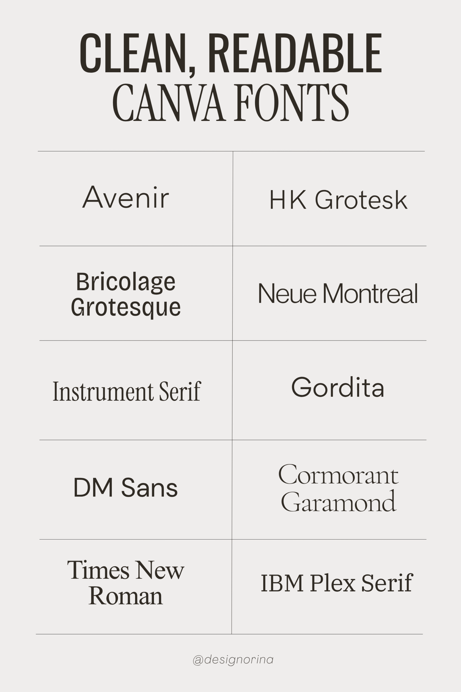
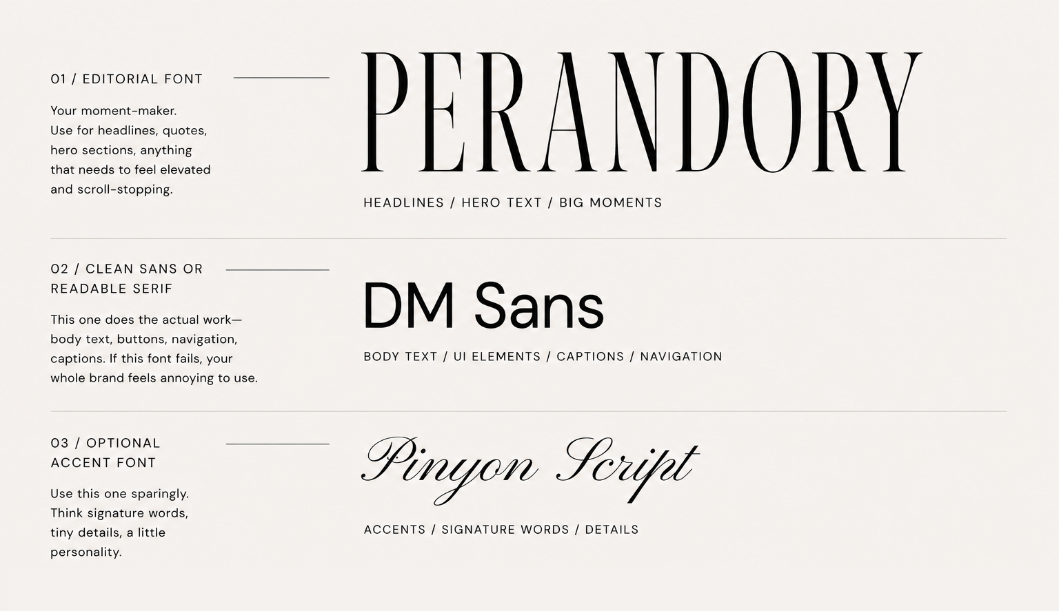
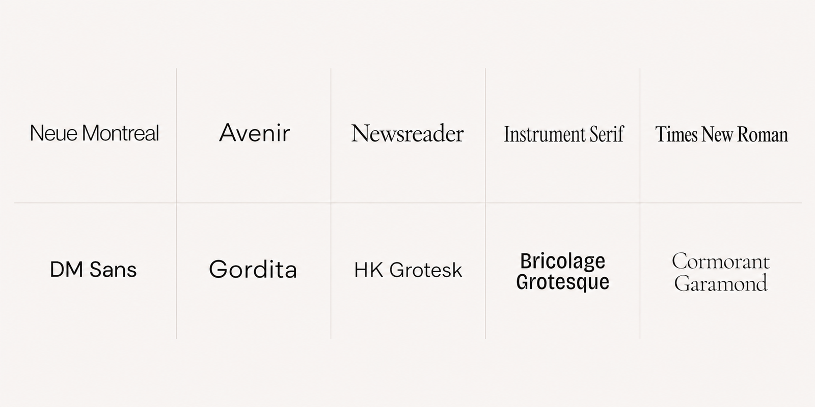
Most premium brands aren’t using a chaotic mix of 9 different fonts. They’re using a tight, intentional system. My go-to is simple and it works almost every time:
1 editorial font
This is your moment-maker. Headlines, quotes, hero sections, anything that needs to feel elevated and scroll-stopping.
1 clean sans or readable serif
This one does the actual work—body text, buttons, navigation, captions. If this font fails, your whole brand feels annoying to use.
1 optional accent font
Use this one sparingly. Think signature words, tiny details, a little personality. This is perfume, not body lotion.
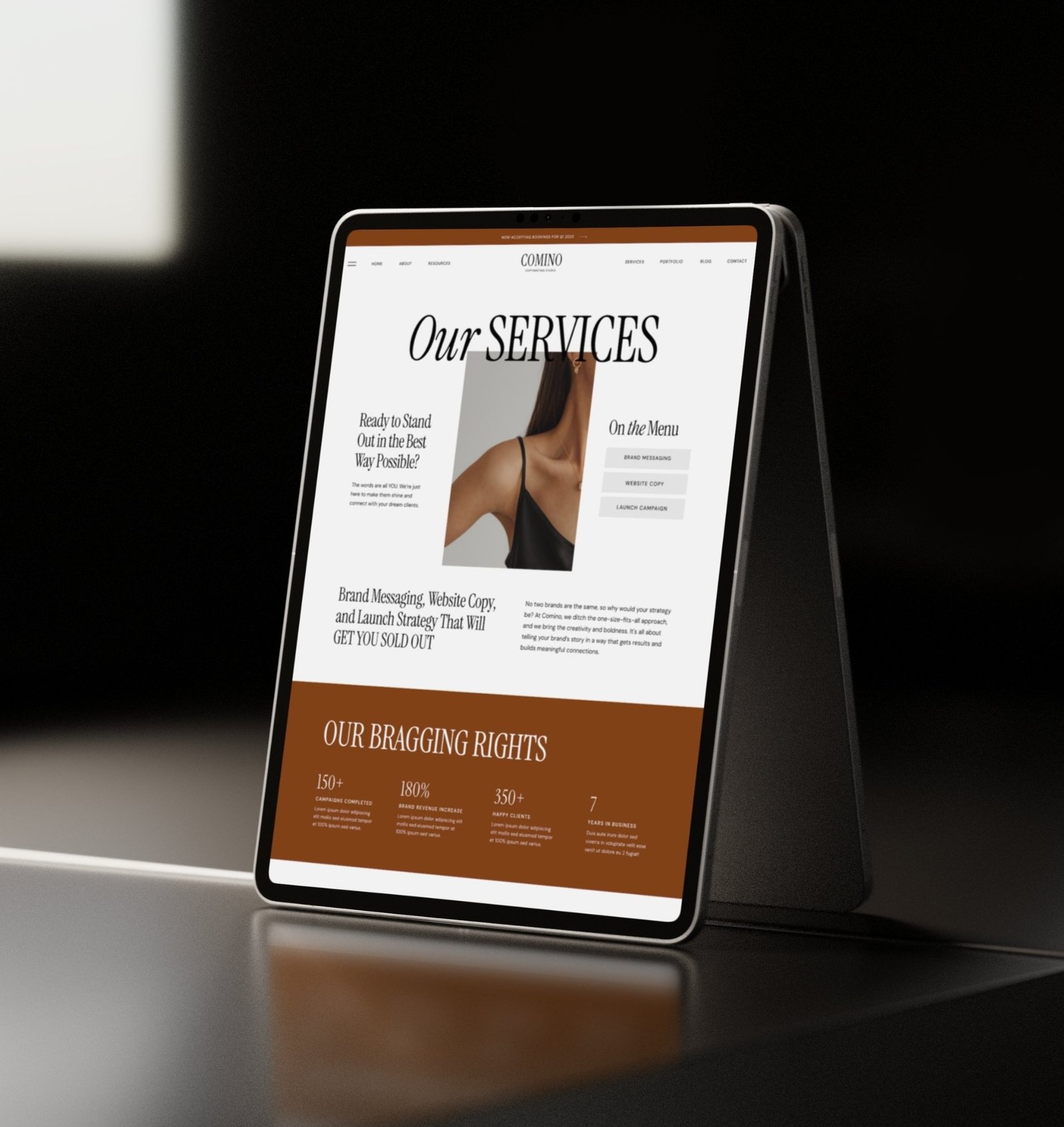
The best examples of this system in action would be the Bergamo Website Template or Soft Growth Website Template.
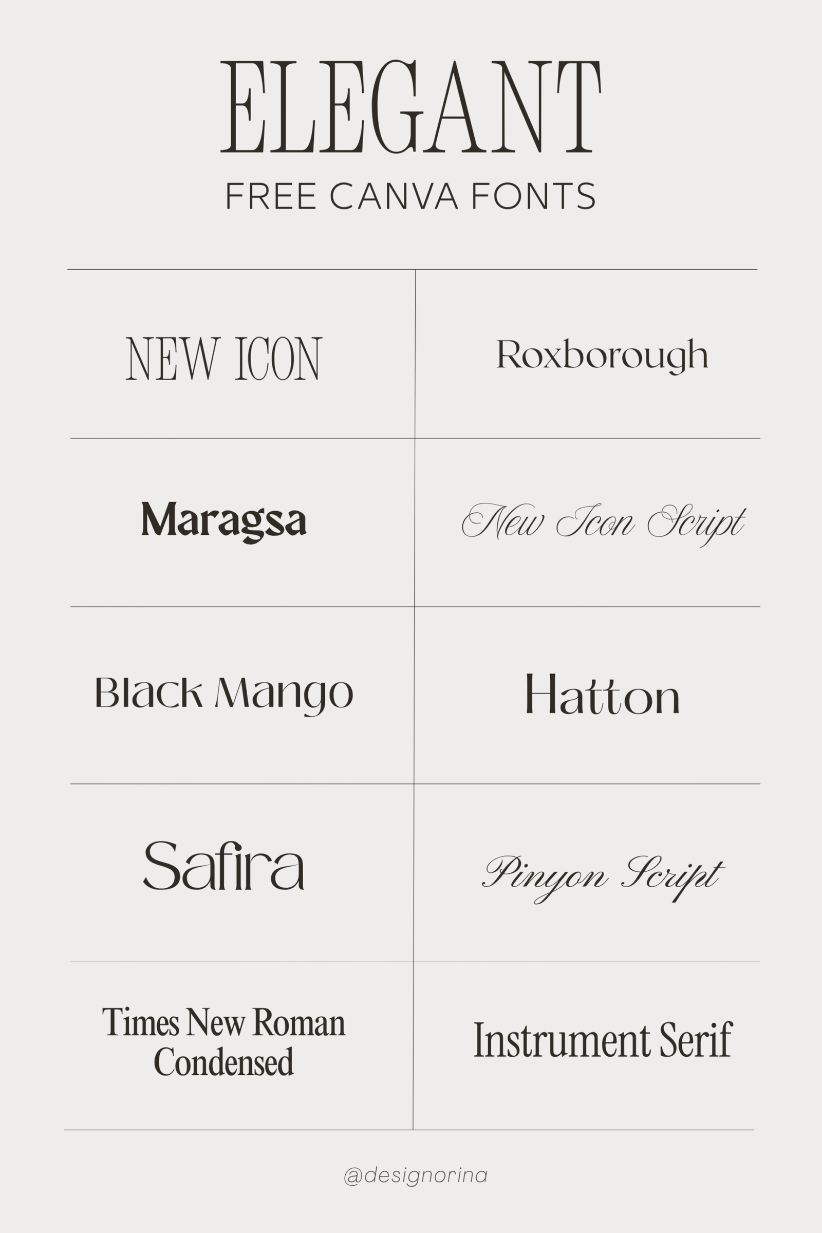
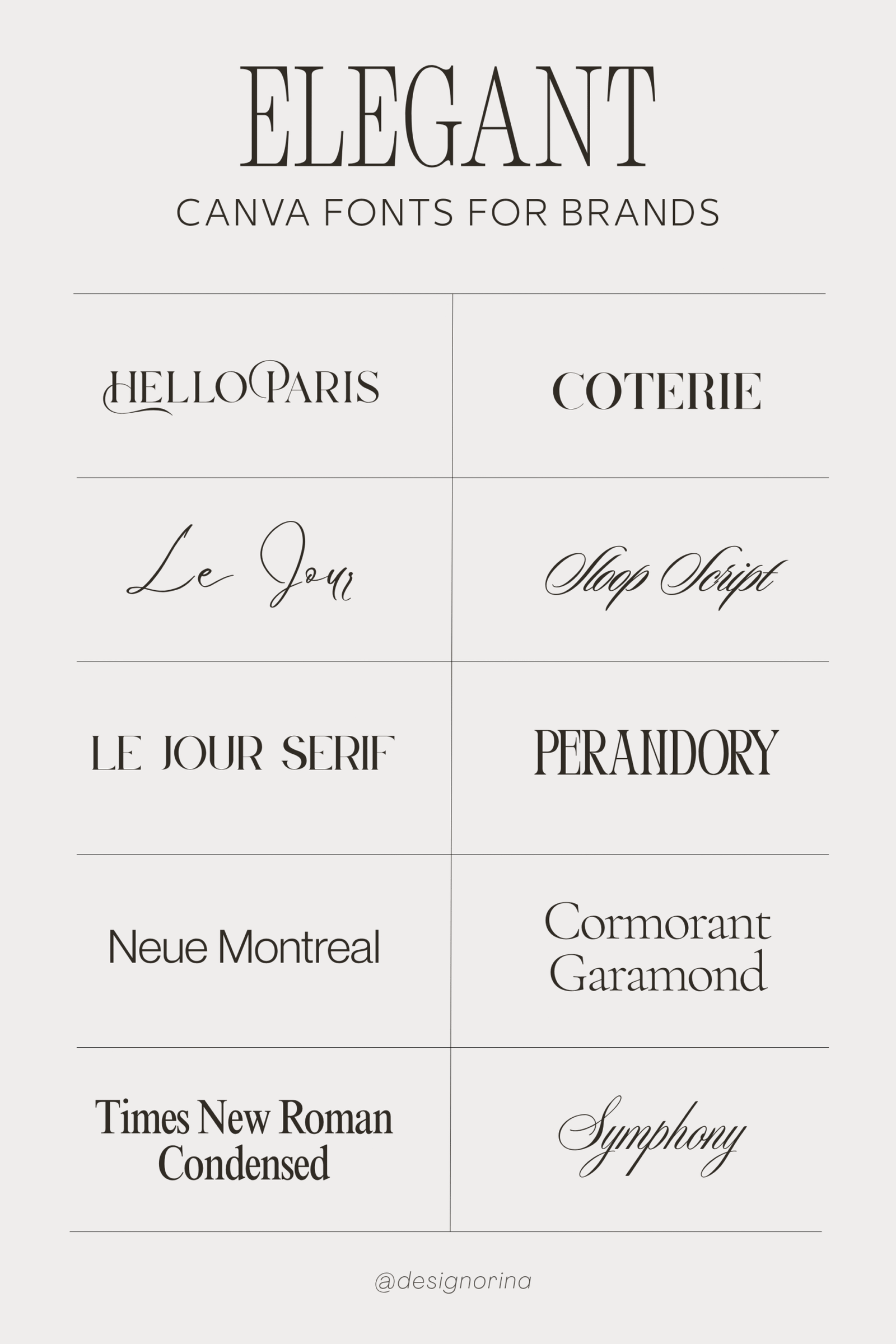
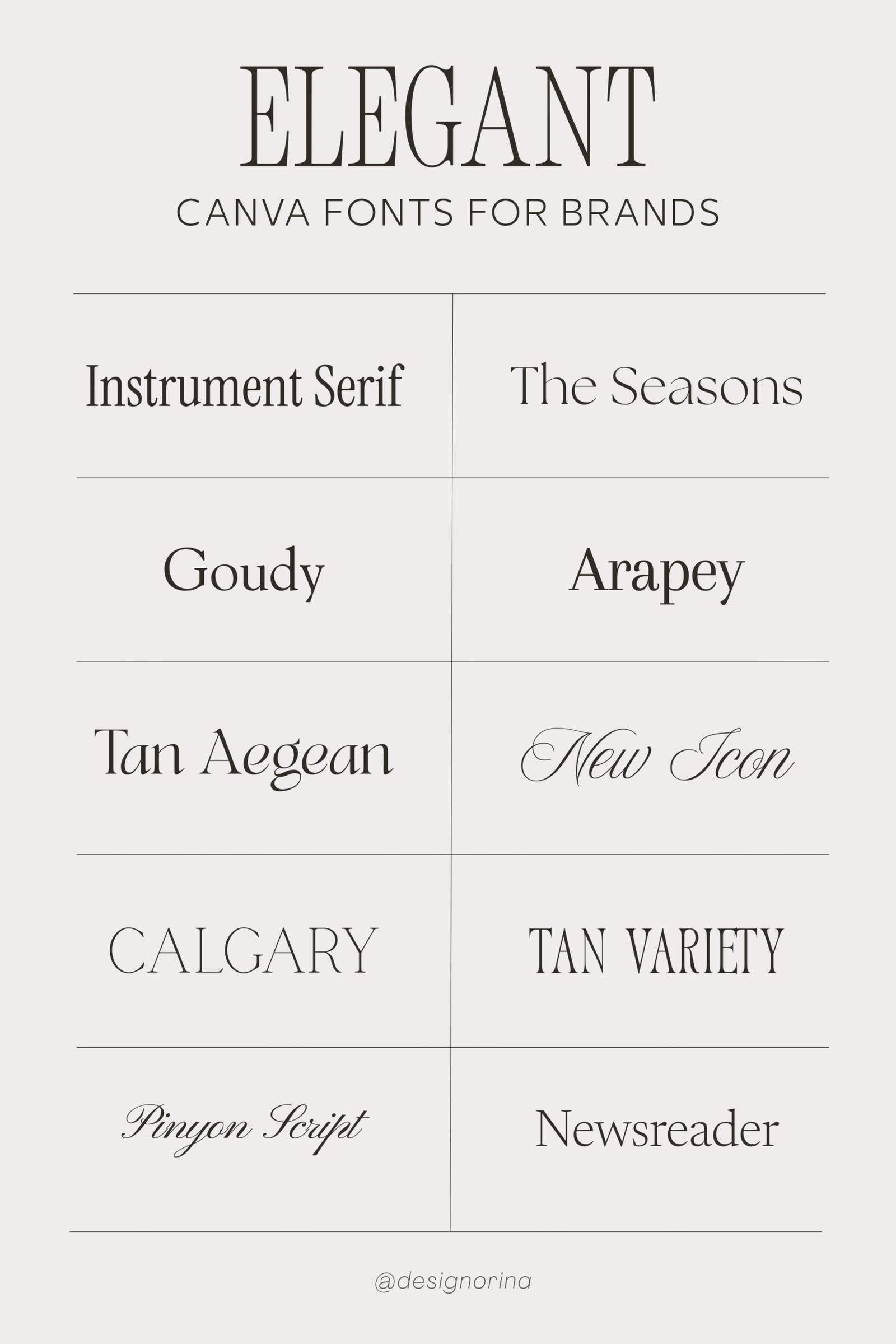
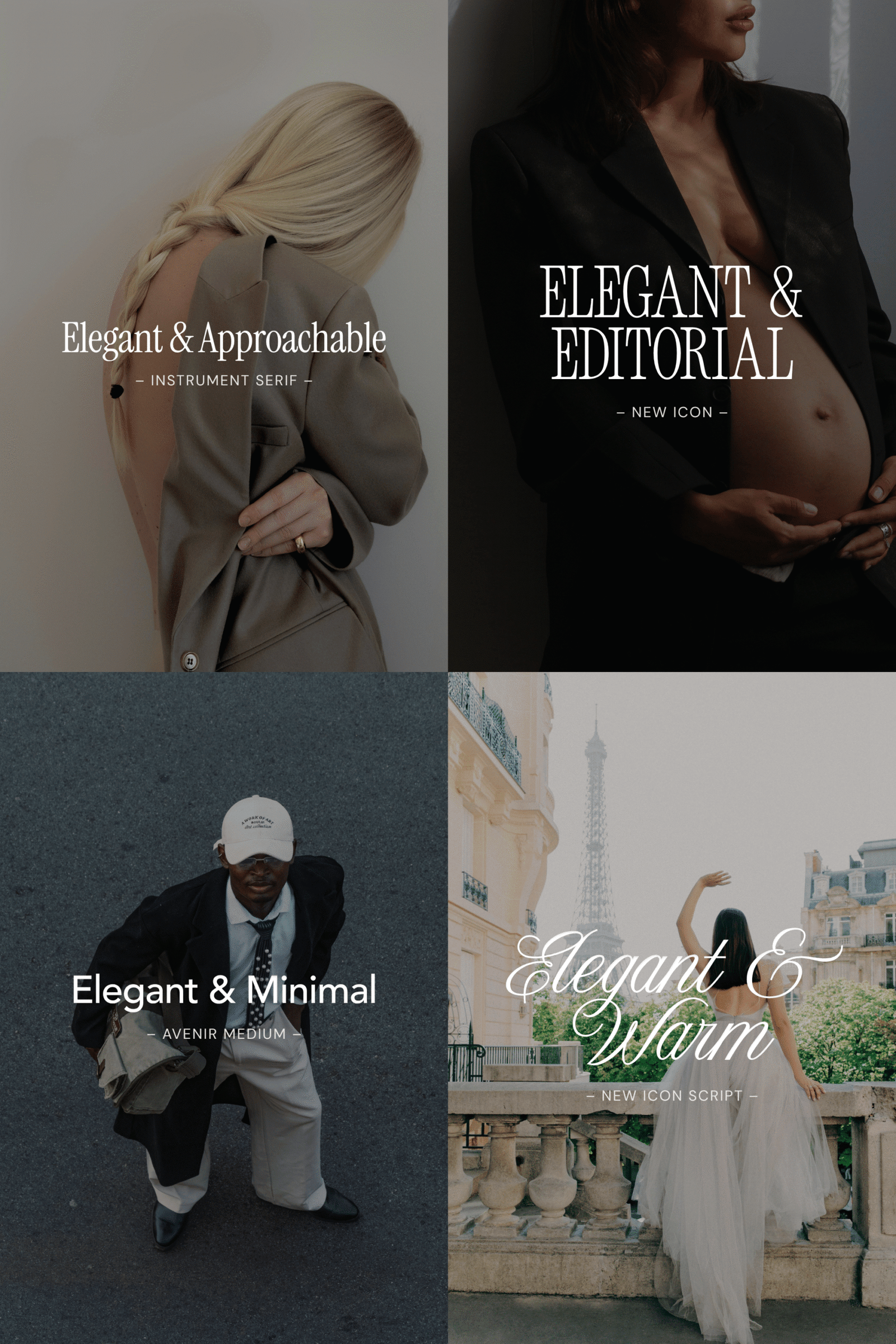
These are the elegant Canva fonts I’d actually reach for when building a refined, intentional brand—grouped by vibe, because that’s what really matters.
Think fashion campaigns, high-end services, creative studios, premium feel.
These are your “main character” fonts. Instantly elevated, slightly dramatic, very chic. Use them for headlines and big moments—not tiny body text unless you enjoy making people squint.
Perfect for wellness, beauty, coaching, bridal, or anything that wants elegance without the edge.
This is where elegant feels warm and inviting. Still refined, just less intimidating and way more wearable across your brand.
Your quiet workhorses. Websites, buttons, captions, menus—this is where usability matters.
Not every font needs to perform. These make everything else look more expensive by not trying so hard.
For signatures, labels, little romantic details. That’s it.
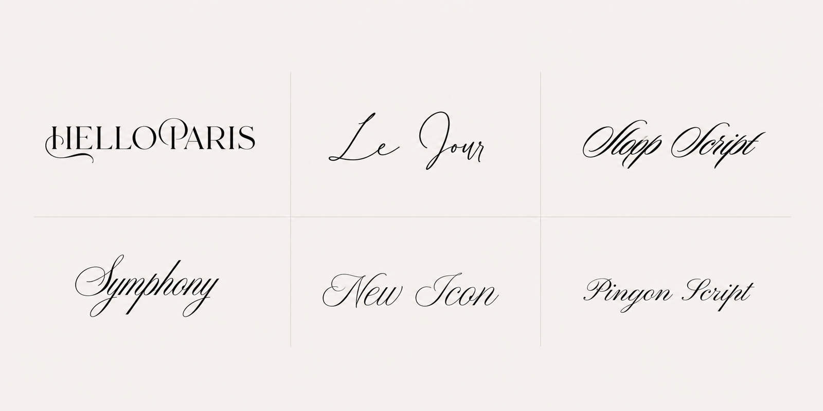
Stunning… and slightly dangerous. One longer sentence and suddenly it’s giving DIY candle label, circa 2016. So use them sparingly.
The same “elegant” font is not going to hit the same across every business—and that’s the whole point. Your niche shapes the direction, but your positioning fine-tunes it.
Go editorial, but keep it sharp. Times New Roman, Goudy, or Instrument Serif paired with DM Sans or Raleway gives you that elevated, design-forward feel without losing clarity.
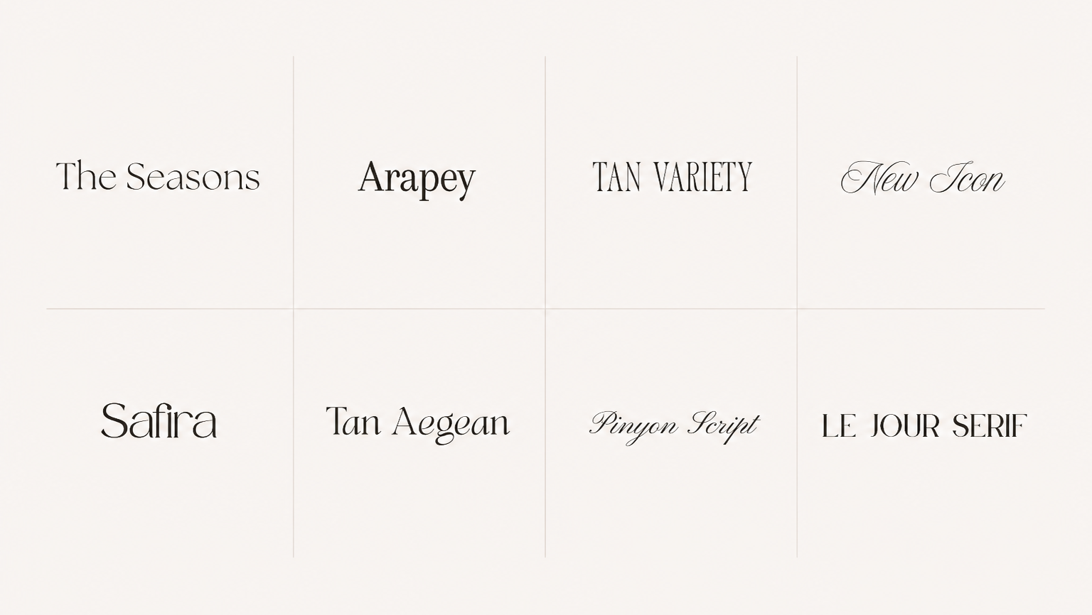
Softness wins here (and a more minimal clean look!). Avenir, Neue Montreal, New Icon, or The Seasons feel calm, grounded, and premium without drifting into cold or clinical.
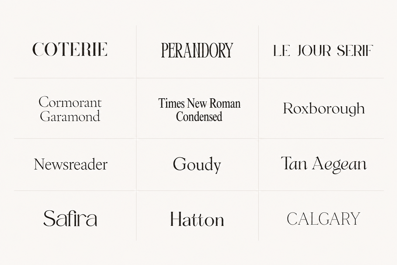
This is your moment for drama. Tan Aegean, Black Mango, New Icon, Coterie, Hello Paris or Calgary bring that bold, high-fashion energy—perfect for big statements and visual impact.
You want elegance, but with warmth. Instrument Serif, Cormorant Garamond, Perandory, Times New Roman Condensed, or Tan Variety paired with a clean sans keeps things elevated and still approachable.
Pull it back. The more premium the offer, the less your fonts need to perform for attention. Try going with Tan Variety, Times New Roman, HK Grotesk, or a simple sans paired with Pinyon Script or a similar accent font.
The issue isn’t that the fonts are ugly—it’s that they’re doing the wrong job. I see this all the time: choosing a font because a brand you love used it, setting entire paragraphs in a dramatic serif that was clearly meant for headlines, or pairing two fonts that are both screaming for attention like… who’s driving the car?
And the trendy ones? If you’re seeing it everywhere, your brand won’t feel distinctive using it. Also—small reality check—copying a font (when it’s properly licensed) isn’t illegal, but it’s also not a strategy.
The biggest miss is forgetting your website entirely. Your font has to work beyond Canva.
Elegant fonts are powerful. Typography alone can make your brand feel more premium almost instantly. But the goal isn’t to look expensive in a vague, Pinterest-approved way—it’s to look aligned. The magic is not in picking the font everyone else is using. It’s in choosing the one that actually supports your personality, your positioning, your content, your offers, and your website as a whole.
Because a beautiful font out of context will always fall flat. A thoughtful brand system? That’s what makes everything click.
If you’re ready for that kind of cohesion, browse my website templates or reach out for a custom brand and web design—everything is built to feel intentional from the first click.