
Your website is clean, professional, and checks all the boxes. It looks like it belongs in your industry—which is great! But if it looks just like everyone else’s in your industry… that’s kind of the problem.
Blending in = being forgettable. And in the online world, forgettable doesn’t convert.
If you’re ready to go beyond basic and turn your site into a branded experience that feels custom, intentional, and scroll-stopping (without being “too much”)—this post is for you.
Here are 10 design features that add personality, polish, and that “wait… who designed this?!” factor to your website:
Micro-interactions—like hover effects—are tiny design details that make a big impact. Whether it’s a link that shimmers, a photo that shifts, or a button that reveals a surprise, hover states create delightful little moments that make your site feel elevated and alive.
It’s like your website is saying, “Oh hey, I noticed you there.”

You know that moment when a site loads and elements just… glide in perfectly? That’s entrance animation done right. Not too fast, not too flashy—just smooth, synced-up movement that feels effortless and expensive.
The key is subtlety. It should feel intentional and calming, not chaotic. If you’re using Showit, play around with timing and easing until it feels just right.

Sticky stacking is that cool layered effect where sections (like services or features) stack beside each other as you scroll. It’s visually dynamic, totally on-trend, and gives your site a modern, high-end feel—especially when paired with standout typography, branded images and intentional whitespace.
It’s built into our Ravenna template, if you want a shortcut to make it happen.

Don’t just write your story—show it. Timelines are a powerful way to share your journey, milestones, or process in a way that feels organized, scrollable, and easy to follow.
Bonus: An interactive timeline makes your About page feel more like an experience than a bio dump. (Yes, we have a timeline built into Ravenna too.)

If you want to grab attention, video backgrounds are your best friend. They immediately add energy and depth, especially on hero sections or behind featured services.
Just keep it subtle—think ambient movement, not action-movie trailer.

If your site feels flat or basic, layering might be the missing piece. Overlapping text, images, icons, and backgrounds can add dimension and sophistication—just like how layering clothes takes an outfit from basic to styled.
Start small: stack an image over a colored shape or pull text half-over a photo. Easy, chic, effective.

A beautiful website is great. But an interactive website? That’s memorable.
Add elements like sliders, clickable icons, and buttons that reveal content. These not only make your site more engaging—they give off “custom-built, high-investment” energy.
One of our faves? The clickable radio-button-style interactions on our Bergamo template—perfect for showcasing values, product info, or your unique method.

Typography seriously sets the tone for your site. If you’re leaning into a sans serif, you can instantly make it feel more bold and modern by mixing two weights of the same font—regular and bold. That little contrast adds structure and visual interest. If you’re going for something more elegant or timeless, a premium serif font goes a long way.
Yes, you can find good free fonts. But let’s be honest: most of the brands you’re obsessing over are using a $30 premium font. It’s a small investment that makes a huge difference in how your brand is perceived.

A gorgeous blog post is nice… but it should also convert.
Make sure your calls-to-action don’t get lost. A sticky sidebar (or floating button) keeps your offers or services always in view—whether you’re inviting someone to book, buy, or explore more.
This is especially powerful if you sell products. Our Shop Kit add-on has a floating “Add to Cart” button that follows your customer around like a helpful little shopping assistant.

Want your site to feel like a luxury experience from the first click? A full-screen menu instantly gives you that sleek, built-out, high-design feel.
Plus, it gives you space to organize your links clearly, add visuals, and guide your visitors through your site with purpose.
We love this feature for service providers and product-based brands—it sets the tone from the start.

Obsessed with these ideas? Same.
And if you want a website that already has these features built-in, check out our templates:

Meet Ravenna Showit website template designed for creative entrepreneurs who want to stand out with a bold, high-end design and smart strategy. It’s modern, versatile, and super customizable, so you can launch a unique, polished website in just a few hours.
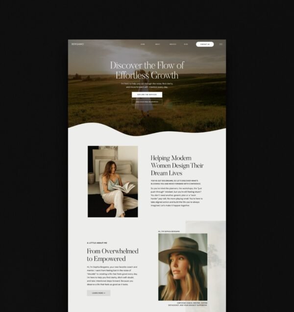
Meet Bergamo, a high-end Showit template for coaches, therapists, educators and other service-based businesses who want to stand out and attract the right clients. It is professional, elevated, easy to customize, and makes you look like you hired a whole team to build it.
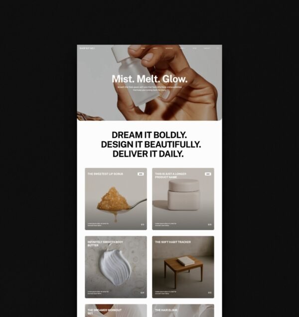
Shop Kit No.1 is a clean, modern add-on for anyone looking to sell on Showit. These pages work with any Showit template and feature elevated design, smooth micro animations, and chic hover effects — creating a seamless, luxe shopping vibe whether you’re selling digital or physical products.